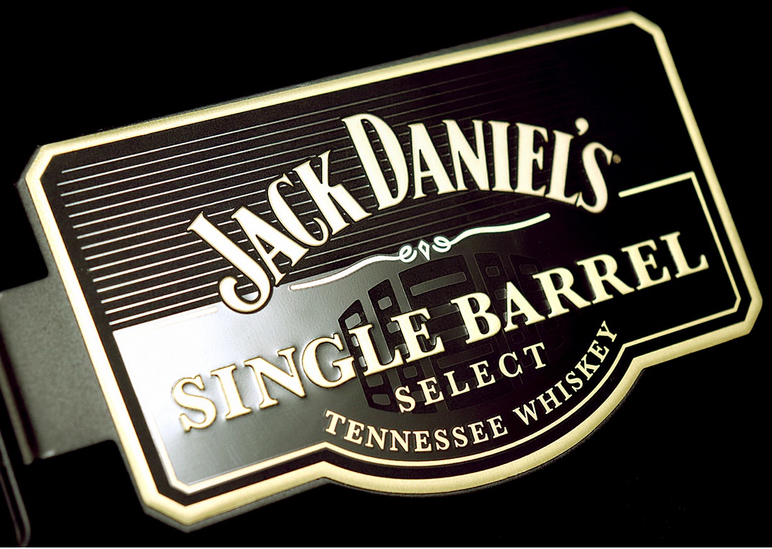
A nameplate can be more than just a placeholder for a company logo. When designed right, it can be the exclamation point in promoting your brand. Incorporating an interesting finish or pattern into the background of your metal nameplate is a great way to do this.

Take a look at this featured nameplate. A few design elements are brought together in this to really showcase the product as a premium purchase item.
- Non-standard shape - one of the first things that I pick up on when looking at this part is that there is a unique shape to the nameplate. The angled corners and push out of the bottom edge are interesting, giving an appearance of a beveled, crafted edge.
- Watermarked Graphic - behind the embossed text is a subtle barrel graphic in a matte black finish to contrast with the high gloss, lacquered black background.
- Precise Linear Pattern - taking the contrasting black on black finish with the watermark logo further, the top of the nameplate is accented with a line pattern. This flows nicely with the rest of the look of the part.
- High End Colors - pairing black and gold is a common way to increase the perceived value of a product. In this case, the gold is low gloss and transparent so that it blends with the black, resulting in subtle and elegant showcasing of the brand.
Taking a good look at all of these pieces of the nameplate design, you should see that they work together. A nice looking nameplate could be achieved using just a couple of these elements - say the non-standard shape and color options. The elements that really make this stand out to me, however, are the inclusion of a custom graphic paired with an interesting pattern into the background. The resulting look elevates the brand and matches with a premium price point.
How Can We Help?
Designing nameplates and labels to stand out in the market does not need to be a source of frustration. Let us help identify options that enhance your product identification with attractive finishes. We're ready.


