Here at McLoone, we believe a nameplate or label isn't just branding, it's an opportunity to elevate your entire product experience!
Patterns, background decoration, and subtle textures can transform a simple identification plate into a memorable brand statement. Below, we'll answer some key questions about how and why to use patterns effectively in your nameplate design.
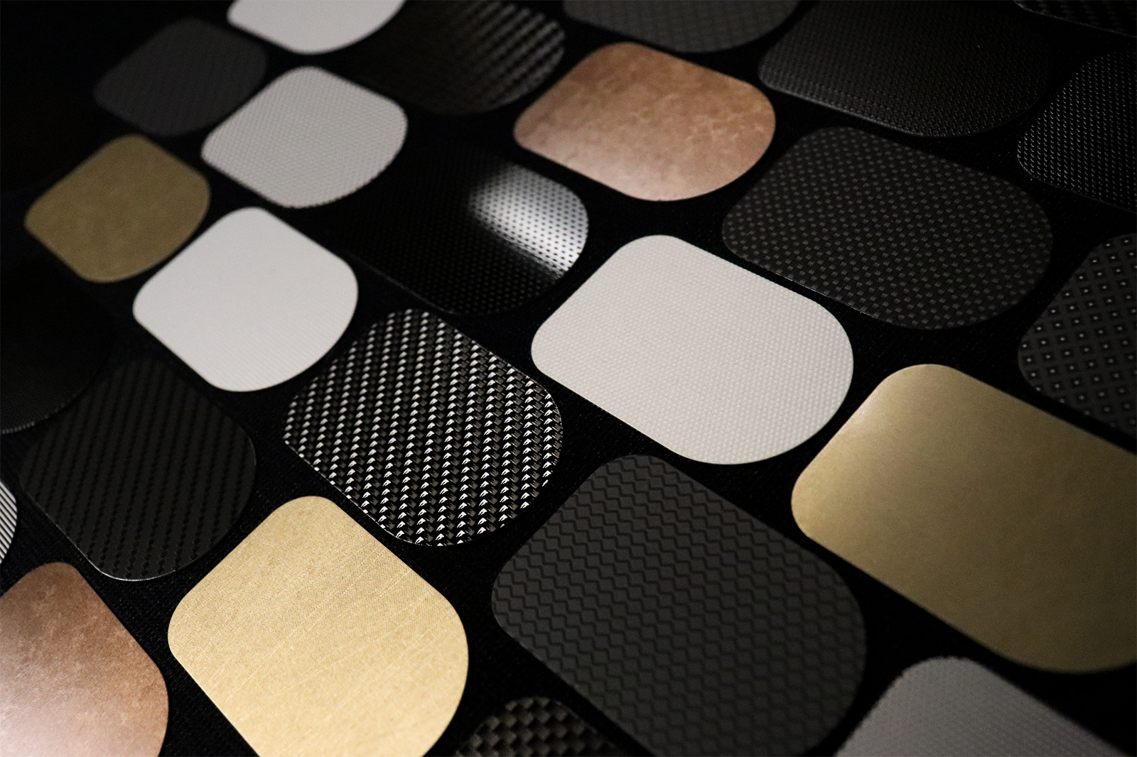
Why do Patterns Matter in Nameplate Design?
Patterns are one of the most powerful ways to add personality, dimension, and distinction to your nameplate or label.
Quick Answer: Patterns enhance both the look and feel of your product identification.
Key Benefits:
- Add visual interest and tactile appeal to an otherwise flat background.
- Offer flexibility appeal to an otherwise flat background.
- Work especially well on metal substrates like aluminum, where the surface adds to the effect.
Pro Tip: If you want to "dress up" a nameplate beyond color and shape, patterns are one of the most versatile tools you can use.
How Can Patterns be Used in Nameplate Design?
When incorporating patterns, start by defining their role in your design.
1. Choose the Role of the Pattern
- Background Utility: Use patterns behind main graphics for depth and texture.
- Accent or highlight: Apply patterns selectively to draw attention or mark product versions (for example, a dot grid behind a serial number).
2. Match Scale and Structure to Your Brand
- Fine Repeat Patterns: Create a premium, subtle texture.
- Bold, Oversized Patterns: Convey an industrial or high-tech aesthetic.
3. Use Placement to Your Advantage
- Apply patterns across the full background for consistency.
- Or confine them to zones, behind a logo, along a border, or in a highlight band.
- Vary scale or density between models for brand family differentiation.
4. Consider Tactile Effects
- Raised dots, etched lines, or screened textures add a physical sensation of quality.
- Tactile feedback reinforces a product's perceived value in premium markets like electronics or machinery.
What's the Difference Between Bold Patterns and Subtle Textures?
Bold patterns create visual energy and differentiation. Subtle textures add sophistication and depth without overpowering.
Subtle Textures are Ideal When:
- You want to maintain focus on your logo or key message.
- You need a low-contrast, elegant backdrop that complements your design.
- You're working with aluminum, where silver-on-silver repeats or brushed tones can enhance brand perception.
How Should I Specify Patterns and Textures for my Brand?
When you're ready to bring patterns into your design, keep these best practices in mind:
- Maintain clear spacing so patterns don't interfere with text or logos.
- Review interactions between pattern, color, and graphics. Everything should work together.
- Request some samples! The lighting and substrate finish can change how a pattern looks in real life.
- Use patterns strategically to differentiate trim levels or product lines.
- Work with an experienced supplier who understands repeatability, registration, and material behavior.
What Makes McLoone the Right Partner for You?
We've seen firsthand how layering patterns and textures can turn a label into a true, branded asset.
We offer:
- In-house expertise with metal substrates like aluminum and stainless steel.
- A wide library of repeatable patterns and custom options.
- Precision execution in screen printing, digital printing, and embossing for consistent results.
- Collaboration from concept through production to ensure your design vision is met.

Download our free eBook and get even more information on using patterns and finishes on your product identification!
Ready to enhance your brand?
Let's explore how patterns, textures, and smart design choices can make your next product identification stand out!
Contact us for a free consultation or to request pattern samples.