Color approval in product identification is often treated as just a simple visual match between a design file and a printed sample. However, in real-world applications, color accuracy in product identification depends heavily on where and how the part is used.
In durable graphics and product identification labels, a color that looks correct in a controlled environment, like your office, may appear significantly different once placed on equipment, machinery, or consumer products. We think it’s important to note that this isn’t true for every label or nameplate, but it is a very common occurrence. This guide will explain how lighting conditions, substrate materials, and end-use environments affect color perception, and what engineers, designers, and buyers should consider when choosing and approving color for production.
Why Color Approval in Industrial Graphics is More Complex than Simple Color Matching
When people search things like:
- "How to match color on metal labels"
- "Why printed colors look different in different lighting"
- "Color matching problems"
- "How to approve color for manufacturing"
It’s usually because they’re encountering a real-world issue: color consistency breaks down after production. This happens because product identification color approval is not just about the pigments or inks, it’s about context.
Color is Influenced and Impacted by:
| Lighting Conditions | Surface Finish & Material |
| Viewing Angle | Installation Location |
| Environmental Exposure | |
How Lighting Conditions Change Color in Product Identification Labels
One of the most common causes of color mismatch in durable custom graphics is lighting variation. Not to get too technical, but this is often referred to as metamerism, where colors appear to match under one light source but not another.
A color sample approved in an office or lab can look pretty different in:
- Retail environments with bright LED lighting
- Industrial facilities with mixed overhead lighting
- Outdoor environments with direct sunlight and UV exposure
- Enclosed machinery where light is indirect or reflective
Key Takeaway:
Color approval must account for real lighting conditions where the label or graphic will actually be installed and used.
For more information on application-driven design, click here to read our blog!
How Substrate Materials Affect Color Appearance
In industrial labeling and equipment identification graphics, the substrate is not neutral, meaning it directly affects how a color is perceived.

Different materials interact with ink and light in different ways. Here's what we've observed:
-
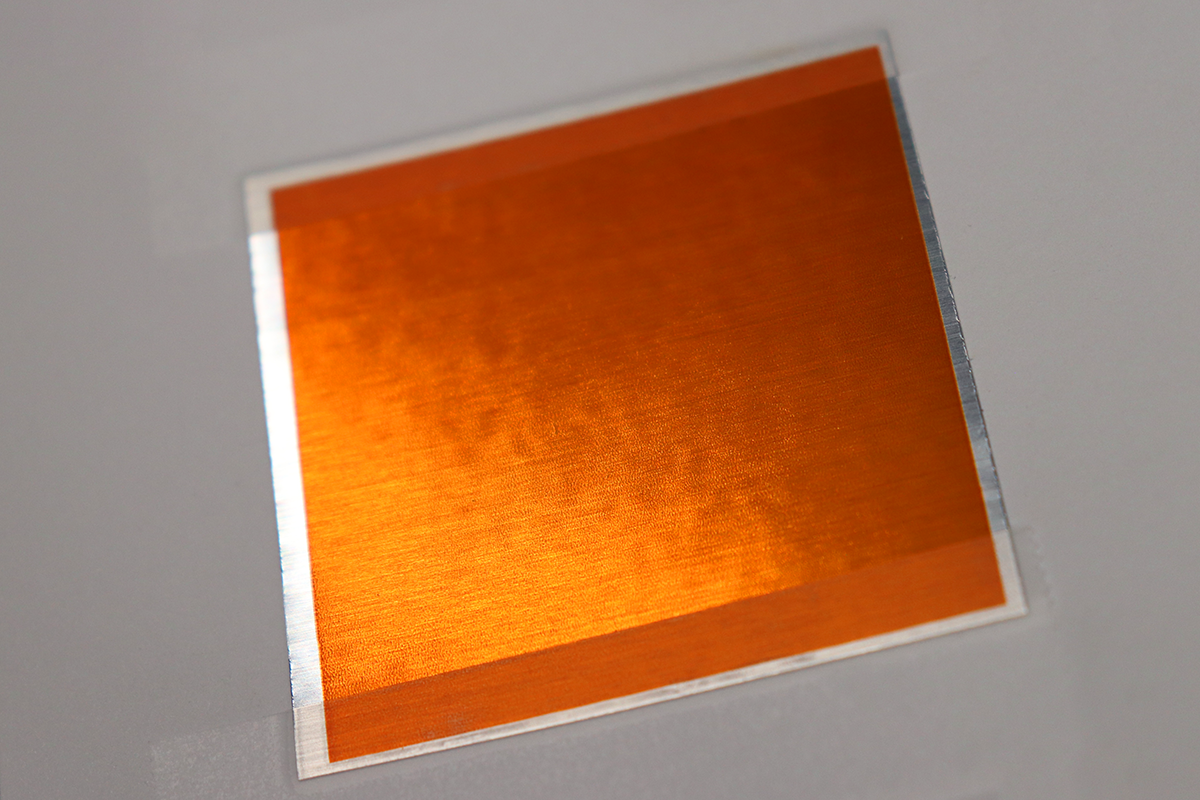
Brushed Aluminum = Directional Reflection Changes Perceived Tone
-
Matte Polyester Films = Reduce Glare and Soften Contrast
-
Gloss Coatings = Increase Saturation and Highlight Reflections
-
Textured Surfaces = Scatter Light and Alter Uniformity
-
Metal-Backed Labels = Introduce Reflective Undertones
What does this mean? The same printed or screened color can look different depending on the material it is applied to.
Key Takeaway:
Color accuracy in product identification depends on the combination of ink and substrate, not just the ink alone.
Looking for more information on our substrate offerings? Click here for our in-depth guide.
How End-Use Environments Impact Color Consistency
In real-world applications, ID plates, labels, decals, and nameplates are exposed to environmental conditions that alter appearance over time.
Take a look through our 'Premium Outdoor Metal Nameplates' guide for more information on durable product identification. Click here!

Some common factors include:
1. UV Exposure
-
- Causes fading or shifting in inks over time
- Commonly affecting outdoor equipment and signage
- Causes fading or shifting in inks over time
2. Temperature Variation
-
- Can subtly change substrate appearance
- Usually impacts the adhesives and top coatings
- Can subtly change substrate appearance
3. Chemical Exposure
-
- Industrial cleaners and oils can degrade surface coatings
- Leads to uneven visual changes
- Industrial cleaners and oils can degrade surface coatings
4. Wear and Abrasion
-
- Surface scratching alters reflectivity
- Changes how light interacts with the printed or screened area
- Surface scratching alters reflectivity
Best Practices for Industrial Color Approval Workflows
To improve color consistency in product identification, teams should move beyond basic color matching and include application-based assessments.
What We Recommend:
- Define the actual installation environment before color approval
- Take advantage of our Pantone Color Matching (Click here!)
- Evaluate samples under realistic lighting conditions (not just office lighting)
- Test color on the actual production substrate (We do print samples! Click here!)
- Consider viewing distance and installation angle
Why Color Consistency Matters in Industrial Product Identification
Color for product identification isn't just an aesthetic element, it impacts:
| Brand Consistency across Equipment | ||
| Perceived Product Quality | ||
| Readability and Usability | ||
| Alignment with OEM Design Systems | ||
| Long-Term Visual Durability |
Conclusion
Color approval for durable graphics isn’t a single-step matching process. It is a multi-variable decision influenced by environment, material, and lighting conditions.
For engineers and procurement teams sourcing durable custom labels for equipment, the most reliable results come from evaluating color in its final context, not in isolation.
True color accuracy is achieved when:
- the substrate is defined
- the lighting environment is understood
- the end-use conditions are part of the approval process
- you choose a partner that will (and can) create an exact color match
In industrial labeling, what you see in approval is not always what you get in the field, but by choosing McLoone, you’re already two steps ahead.