It's always interesting to look forward to a new year and the what if opportunities. It's a fresh start, open book kind of feeling. This year has been like no other, and from what our customers are relaying, it sounds like 2021 is going to be an interesting ride of re-establishing their place in the market. Companies are returning to order patterns which is encouraging. Some are finding that this is a good time to re-brand themselves.
An article exploring trends expected for packaging design hints that patterns and finishes are sure to be design elements that will be center and focus. These trends can inspire attractive nameplates and labels for product identification. Options include technical metal finishes, attractive faux finishes as well as attention grabbing surface decoration with contrasting gloss levels or metallic inks. Including a pattern in the design of a nameplate can help differentiate your product from others on the shelf.
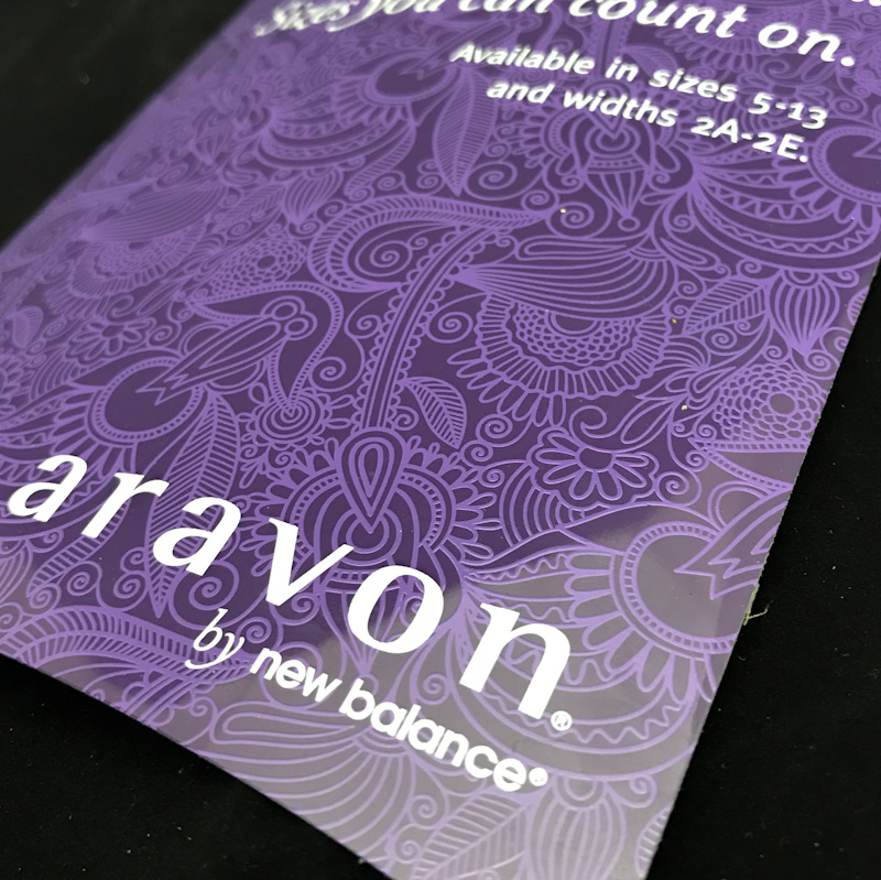
Illustrated Patterns - Patterns on aluminum can be as whimsical or structured as you like. They can take over the full background of a nameplate or simply be used as an accent feature to add interest. This example shows a POP display nameplate with a textured background pattern that could be seen as its own piece of artwork.

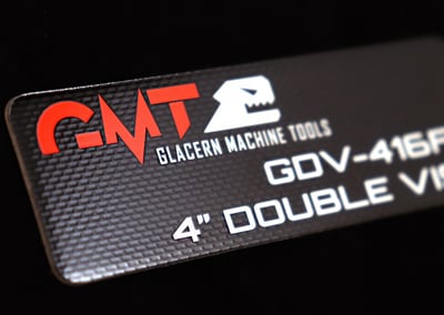
Simplistic Geometry - Technical finishes translate recognizable geometric structures into repeatable patterns on aluminum surfaces. Take advantage of the metal substrate and allow the reflective surface to show through for attractive and contrasting looks. These types of authentic metal surfaces can be found within consumer electronics, sporting goods, industrial equipment, power sports trim, and many other markets. Precise technical patterns can be integrated into decorative trim, nameplates, badges and labels as background decoration or in selective areas to draw attention. Color, gloss and scale are fully customizable to suit your needs.
More than Patterns
While patterns and finishes are on the watch list for 2021, there are basic design elements that play a part in any product identification. Simplicity and minimalistic design remain popular and attractive ways to showcase a brand.
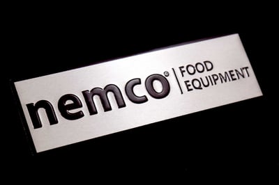
Product Name Location - Similar to print or digital advertising, the space around the graphic and text matters for nameplate design. This white space helps to set the stage and give a platform to build for your brand to stand out. Be sure to allow adequate space to clearly promote your brand.
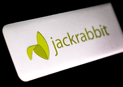
Use of Color - Incorporating color into your metal nameplate allows you opportunity to add interest to what otherwise might be an average looking part. A spot of color can draw attention to a logo or specific line of text. It can be a defining element that sets your product apart.
How Can We Help?
Metal nameplates and badges can be dressed up by adding color for contrast, using a screened texture for dimension or incorporating a pattern into an area for accent. These options provide flexibility in creating a unique look that enhances nameplate design. Need ideas to take your brand to the next level? We can help!
Related Posts
Creative Tips for Effective Product Identification
3 Simple Ways to Differentiate Your Nameplate
3 Things to Expect from a Nameplate Design Project
Where and When it Makes Sense to Use Patterns for Awesome Nameplates
3 Considerations to Determine Location of Product Identification

