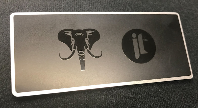
A popular trend in nameplate design is to create tone on tone looks with contrasts between background decoration and text or logos. Many times this is involving silver on silver or gold on gold tones. This two-tone look can be achieved in other colors as well. Here is a great example showing black on black decoration and how it elevates the brand.

I love the look of this nameplate! Your eye is drawn to the high gloss black graphics. The contrast with the soft matte background is an elegant and luxurious look with visual dimension. Incorporating a bright aluminum border completes the look with a nice frame.
How Can We Help?
Are you looking for ways to enhance brand awareness but need some guidance? Our Customer Care team is ready to work with you and find the right solution. You can also check out our 7 Ways to Increase Product Branding eBook for some inspiration. We're here when you're ready for discussion!
Related Posts
Subtle Surface Decoration with Textures on Aluminum
Contrasting Gloss Elevates a Brand
Metal Nameplate Decorating Options