I spent some time recently helping out a local preschool during an afternoon art activity. Simple coloring a basic house scene with classic color markers and crayons was the task at hand. I asked a seemingly innocent question of the group of 6 children sitting at the table with me "What is your favorite color?" This spawned expected answers of "red", "blue" and "yellow". I heard other tables starting conversations around favorite colors as the children worked on their projects. It was interesting to me that along with the standard colors, there were responses of "reddish-blue", "orangey-green" and "pinkish-gray".
Reflecting on this experience and looking at all the variety of projects that come in to McLoone, the world of color for brand awareness is amazing.
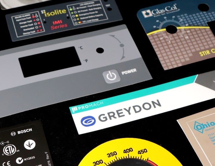
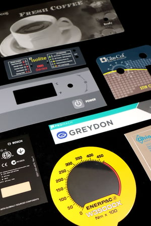 Color Options for Nameplates and Labels
The spectrum is generally wide for options and varieties of color combinations for nameplates, ID plates, labels and graphic overlays. In that respect, color is not a big deal. Any nameplate or label can be decorated with as many colors as you need; however, keep in mind that multiple colors will impact your cost. Many companies are able to design an effective nameplate with just one or two colors.
-
Spot Color - opaque, transparent and metallic colors can be called out.
-
Color Gradients - subtle variations in color hues can be achieved using half tones and fades.
-
Process Color (CMYK) - wide spectrum of options can be achieved.
When Color Matters for Product Identification
Some colors are regulated by legislation or industry standards. An example of this is "safety orange" found on warning labels. The wrong color can mean improper operating of machinery or handling of material.
Color can also be used to give an indication of luxury or prestige. It can invoke an emotional response and impulse to pick your product instead of the next on the shelf. Most nameplates sync with the color scheme of the end product.
Product designers often pay attention to forecasts to identify a custom color palette that coordinates with the overall brand marketing strategy. Pantone and Color Marketing Group's color alerts are popular sources for publishing these color forecasts as well as naming "Color of the Year".
Regardless of whether your product design uses a regulated or custom coordinated color scheme, the artwork provided should provide clear direction. This includes referencing specific color information (PMS or target color number), the substrate material and gloss requirements.
Producing quality parts dictates that they match expectations in size, shape and look. Color is an important part of this review. Once you have defined your target color with the required substrate and gloss, we take over to develop a custom formula to match the specs. The formula is kept on file along with your review of acceptable variances to ensure consistency from run to run.
How Can We Help?
Color should not be an area of concern for your product identification. McLoone has a long history of providing quality parts meeting or exceeding expectations of our customers. Let us work with you to make sure your next nameplate or label has the right color to keep your brand looking good.
Related Posts
Defining Background or Graphic Color for Nameplates
Common Concerns Affecting Longevity of Metal Nameplates
Color Influences for Brand Recognition
Gradient Colors Add Interest to Nameplates and Labels
Artwork Requirements for Effective Nameplates and Labels

Originally published January 17, 2019, updated March 30, 2021 for clarity and resources.